
Brand Aid's Jeremy Mansfield on UX, Content Strategy and Client Communication
We spoke with Jeremy Mansfield, Creative Director and UX Design Lead at Brand Aid, about his work, content, clients and UX Kits.

Tell us about yourself and your work at Brand Aid.
A designer at heart, I’m passionate about crafting beautifully branded user experiences for customers in product spaces both large and small. I strive to make user interfaces across various branding touch points meaningful, memorable and clear. My background is in design, but my passion is in development both from technology and brand storytelling vantage points.
My professional career spans design work for companies like Johnston & Murphy, TRASK, Thomasville Furniture, The Ernest Hemingway Collection, The Brain Trauma Foundation and various entrepreneurial startups. I've also founded an app and merchandising company for the hunting industry called the Urban Archer. Most recently I have been working with teledentistry startup the SmileDirectClub leading their UI/UX efforts for their SaaS patient and provider portals. I'm known to lend a helping hand to non-profits, passionate about the outdoors, and photobomb strangers more often than not.
What project did you use UX Kits for and how did they help?
Where UX Kits totally saved me and really made the project shine was working with multiple key stakeholders and various consultants who were in the pipeline before me.
Anchor Transportation had hired a design firm to develop a brand standards guide for cleaning up their color palette, new typography, print materials, etc. That design firm was hired by the same consultant that ended up hiring me to do the design and development of the new website. She was working as the main point of contact with key stakeholders. Instantly I knew with that many layers I needed to have a solid IA / UX policy in place to ensure we were nailing the right content, structure and flow of information before we dove headlong into the design.
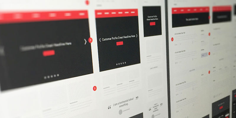
I don't normally move into wireframes on a project, but sometimes when working with larger teams of consultants and key decision makers, I've found I save a lot of time in the end by forcing them to focus on content first and understanding the user flow vs. just seeing what the design is like, which is what they get most excited about.
We've all heard it said that content is king, but I firmly believe that execution is emperor and sometimes wireframes are the key to ruling a project's universe. In this case, your wireframes allowed me to nail it out of the gate and quickly move into designs that didn't have to go through very many feedback rounds at all since they already had a content strategy in place.

You mentioned the importance of concentrating on content and UX first, despite the excitement of wanting to get to design. Do you have any suggestions or strategies on how you communicate this to clients and initially keep their focus away from design?
Again, restating my “Content is King, but Execution is Emperor" mantra, I try to get the client to understand the importance of knowing what their story (vision) is and the best strategy (structure) for telling that story. I strongly emphasize this will save them time and money in the long run as it will keep the focus on content hierarchy at the beginning when we can rapidly prototype vs. in the design stage when high fidelity comps become very cumbersome (time and cost wise) to keep revising.
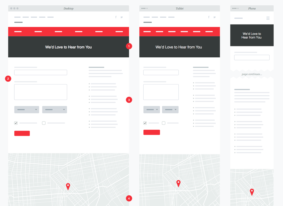
It always causes frustration for both the client and the designer when they think it’s just a “small” change request they are asking for on a design, but don’t realize it’s actually a structural (content) change they are making that could cause the entire design to be rethought. As we’ve all encountered, this can push the timeline back and exceed budget expectations. Having a well crafted content strategy with something as simple as these responsive wireframes or the information architecture charts allows me to succeed with hitting home runs on the creative execution of that content hierarchy. I rarely, if ever, have any changes to my designs at that point once I present the best one forward. The structure and content were already approved. Now it’s all UI fun!
We often get asked about presenting our wireframes and flows to clients. There are many options out there, from PDFs to prototypes to printouts. What sizing, formats and methods do you prefer when sharing these types of documents, and how do you walk clients through them?
PDFs are definitely my favorite way to get these into a client’s hands. They can view at their own leisure, and I honestly don’t have to walk them through anything. With the numbered callouts and notes format, everything is covered for them to easily go over when convenient for them instead of having to work around everyone’s schedules with a conference call or screen sharing. The kits make it super easy for the client to understand everything. And for me, that’s what is most important as I strive to make all my work meaningful, memorable and clear.
1 comment
This is helpful, and I appreciate your insight on how UXKits helped you with this project. Your Dribble portfolio is great. You do good work.
Ryan Boomershine
Leave a comment
This site is protected by hCaptcha and the hCaptcha Privacy Policy and Terms of Service apply.